Trend #1 - Colours

Milan Design Week 2025

Had Milan made it into Invisible Cities, Italo Calvino might have called it a city with a hundred and forty-four faces.

Every ten minutes, with the steady movement of the sun, the shadows shift and the colours change. Light and shadow trade places, dancing across one another. Every time you turn around, buildings seem to have put on new clothes. Warm yellows change to matte golds and back again whilst greys are infused by and drained of sunlight in turn.

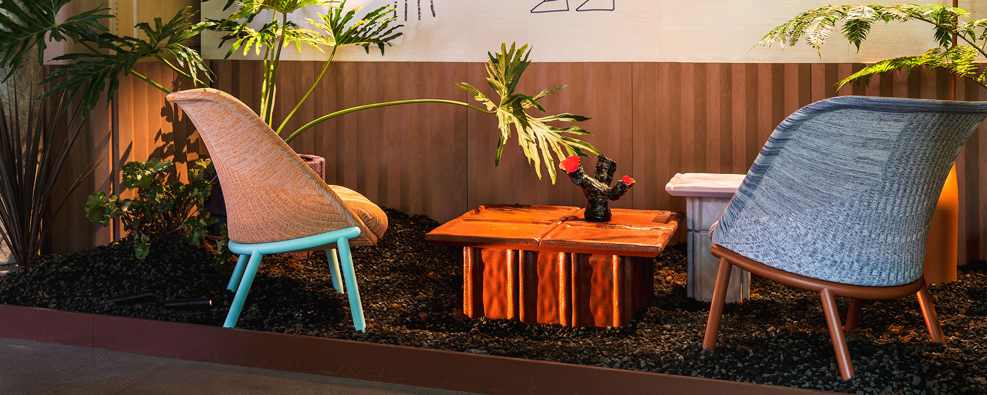
Our first days in Milan were dedicated to exploring colour – and there is no one better to turn to for guidance than the global experts, Pantone. On that note, we were thrilled to officially launch the Haworth x Pantone collaboration at Milan Design Week. The launch culminated in the Uroboro at the ALCHEMICA exhibition – but more on that below!

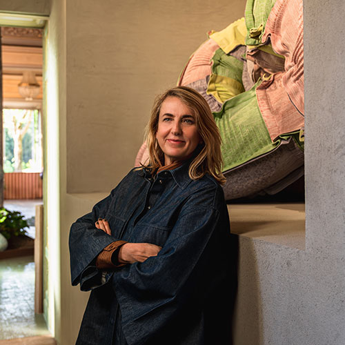
We spent a delightful day discussing colour with Jane Boddy, the expert colour trend forecaster at the Pantone Colour Institute; Patricia Urquiola, whose chromatic intuition is renowned; and Tannese Williams, who led the development of the stunning Pantone Dualities range.

Dualities includes both light-filled pastels and shadowy blacks, greys, and whites. The range captures all the contrast, the tension, the tenderness, and the nuance that the design world seems to be crying out for in our moment.

Jane Boddy walked us through the New Age pastels in the Dualities range.

‘We’re now in an era which is all about these really dynamic pastel levels,’ Jane said. ‘There are pastels which kind of have a more softened, smoked aspect to them; there are pastels which have more life within them. In some cases, you might even say those pastels get close to a neon – but they’re not a neon, they’re just a really punchy, lively pastel tone.’

‘When you think of a pastel, you’ll think of a colour that has a very low saturation,’ Jane said. But the New Age pastels in Dualities are different. ‘There’s a lot of saturation within them… the colours are quite rich, but you still call them a pastel. They’re kind of at the upper end of the brights. I always like to say that New Age Pastels is actually a colour range that defines our times.’

There is much more to come from our conversation with Jane, but as a quick takeaway, we can recommend that you keep an eye out for pastels infused with light – saturated with light. The New Age pastels of Dualities epitomise this concept.

For many guests to Milan, the ALCHEMICA exhibition by Elle Décor Italia will be the highlight. Held in the historic Palazzo Bovara, ALCHEMICA was conceptualised by Patricia Urquiola. The exhibition guides guests through three stages of the alchemical process.

The heartbeat of the exhibition is the Uroboro. A reimagining of an ouroboros – the classical symbol of a snake eating its own tail – the Uroboro consists of a large serpentine form upholstered in four of Pantone’s New Age pastels. The fabric is the same waste-minimising digital knit used on the Haworth Cardigan Lounge.

‘They were always a bit lost in the fantasies of transformation,’ Patricia Urquiola said of the alchemists. ‘The most interesting thing was this idea of trying to get better things. The tension was the most interesting thing of alchemia.’ Transformation is at the core of alchemist philosophy – and the Uroboro. ‘It’s a symbol of transformation,’ Patricia said. ‘And it’s something we have to always understand inside us… What is the way to move, transform yourself, evolve?’

Look out for more about the Uroboro and Patricia’s philosophy in our trend report.

Our final interview of the day was with Tannese Williams, who led the development of Dualities as the head of Furniture, Home, and Interiors at Pantone. Given her intimate connection to the Dualities range, Tannese quickly found thematic overlaps with Patricia’s Uroboro. ‘Ouroboros is all about continuous becoming,’ she said, ‘and so is Dualities.

Just as Uruboro celebrates the yearning for transformation, the Dualities range provides a palette for the full range of expression. ‘It’s a human story,’ Tannese said. ‘And I think anytime we bring emotions and humanity to the design, it will resonate with our audience.’

Tannese also spoke to the shared values that make the collaboration between Pantone and Haworth such a promising one. (And she expressed herself far more eloquently than this writer, who used the word ‘pumped’ more than was probably necessary.)

‘Haworth understands that colour is not just a hue – it’s an emotion,’ Tannese said. And the sense of fantasy that Patricia spoke to came back around when Tannese addressed our partnership. ‘Haworth knows how to do function and fantasy really well… It was actually an easy collaboration with Haworth, because we stand for the same things.

Our first days in Milan broke colour in two. For in Milan, every sunray, every shadow is taken into account. This is what it means when people say that Milan is our global capital of design; almost every surface in the city is considered. What will happen when light lands here? What will change as shadows fall?

From every angle, sun and shadow play; from every point of view, light and darkness dance. In Milan, the nuance of colour as sunlight falls and drops away is evident nearly everywhere one looks.

The more Pantone described the contrast, tension, balance, and harmony found within the Dualities range, the more clear it became that our design moment calls for a palette with unlimited emotional potential. We yearn for spaces of surprise; we cry out for spaces of lament; we long for spaces of celebration. With the palette that Dualities offers, all emotions can find their place – all are welcome.

And that is the power of colour. When all expression is possible, who can stand between us and joy?


Listen to article

Note, if the audio player does not show, you may need to accept preferences cookies to enable the player.