Pantone’s 2026 Color of the Year, Cloud Dancer, reignited a conversation already underway: the return of white and soft, breathable palettes to the modern workplace. Not as background, but as a quiet foundation that supports clarity, focus, and well-being, especially in environments designed for diverse sensory needs. In this piece, designers trace a simple arc—from foundation to well-being—to explain how gentle hues help the workplace feel (and work) better.

24/02/2026 • 5 min read
White is never just white
Designers on the Soft Story of Cloud Dancer
The canvas that sets intention
"I LOVE IT. The pantone colour of the year has always been a selection of a strong colour that sets it apart from other hues. I think the Cloud Dancer resonates in a more philosophical way than just being the colour of the year. It opens more possibilities and pairing as it’s more of a ‘canvas’ colour than ‘the’ colour. But at the same time, white can also be a strong colour in a way."
- Pam Jouwena, Hassell
Soft neutrals aren’t passive. Used deliberately, they create a coherent baseline, a canvas that lets light, materials, and people come forward. This is the quiet strength of white at work: intention, not absence.
In practice:
- Anchor large visual surfaces—workstation screens, collaborative seating, wall panels—in warm off-whites to reduce visual noise.
- Let texture do the talking: linen, wool, felt.
- Where traffic is high, specify performance finishes or removable/washable covers to maintain a light palette without compromising durability.
Architecturally, that “canvas” becomes literal—on walls, ceilings, and built‑ins that set the tone without stealing attention.
“Cloud Dancer feels quiet and almost weightless—restrained, not cold—bringing calm, clarity, and timelessness. It isn’t classical white, but a soft backdrop that gives space. As a foundation on walls, ceilings, or built-ins, it reflects light and opens rooms; with wood, stone, and textiles it turns warm and residential, while in minimal or corporate settings it brings elegant calm. It signals a move toward reduction and balance—away from visual noise, toward lasting, people-centered spaces. The color for those who don’t need a show—Cloud Dancer does it with understatement.”
— Charlotte Weyer, CBRE Germany
Stability in complex environments
“Cloud Dancer is a soft, dynamic white that brings lightness and calm. Ideal for large spaces, it sets a refined base without the monotony of pure white.”
— Gensler – Siren (Shanghai)
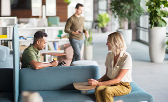
Open plans and hybrid floors hum with activity. Soft neutrals offer visual stability. They unify the field of view, reduce distraction, and keep large volumes feeling refined rather than overwhelming.
In practice:
- Specify low-contrast textiles for calm, consistent sightlines.
- Use light-toned dividers and panels to support focus without creating hard visual breaks.

Emotional clarity and gentle diffusion
“Cloud Dancer is a light, almost ethereal white, where warm and cool undertones coexist. It is not just an easy colour: it is a response to our times — a silent call for reset, tranquillity, focus and renewal. It functions as an elegant and timeless blank canvas. It reflects light delicately and creates the perfect backdrop for art, furniture and textures to reveal themselves, with presence, against a neutral background that welcomes and breathes.”
— Erika Okazaki, Associate Architect at OpenBook
Soft whites shape not just visibility but feeling. They diffuse light gently, reduce glare, and invite a quieter kind of presence. The effect is especially valuable for colleagues sensitive to brightness or contrast. Where available, consult light‑reflectance guidance from suppliers to balance diffusion and glare near glazing and screens.
In practice:
- Combine pale palettes with acoustic diffusion to soften both light and sound.
- Choose light interior schemes for pods and booths so small spaces feel open, not confining
From focus to hospitality
“A versatile neutral that never feels bland — not clinical, not forced. It adapts to any mood and lets other materials shine, from relaxed to luxe.”
— Elena Ma, Woods Bagot
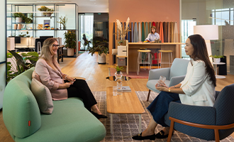
Soft palettes flex across typologies and tones, supporting the focus of a library, the energy of a project zone, and the welcome of a lounge. They provide a cohesive base while letting materials tell richer stories.
In practice:
- Bridge zones with enduring finishes.
- Shift the mood with accessories — timber, greenery, sculptural lighting — without sacrificing calm.

A sensory-led approach for every mind
“Cloud Dancer feels rhythmic and sensory-led. Muted and gentle, it aligns with well‑being and neurodiversity-focused design, a calm counterpoint to today’s chaos.”
— Joanne Morris, Unispace
The Haworth Neurodiversity Design lens underscores how gentle contrasts, predictable palettes, and tactile comfort reduce cognitive load and support psychological safety. Soft neutrals turn this insight into everyday experience.
In practice:
- Focus & pods: light interiors to avoid harsh contrast and glare.
- Restore spaces: tactile neutrals (felt, wool, bouclé) for grounding and decompression.
- Transitions: prefer subtle tonal shifts over abrupt colour changes, using material texture or light temperature to cue movement between zones.
Where soft neutrals thrive
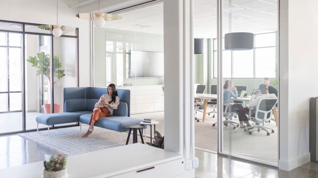
Focus spaces
Light-toned screens and surfaces, for lower stimulation, higher concentration.
Collaboration areas
Acoustic curtains and modular seating in natural linens to provide energy without visual overload. and cut reverberation while keeping visual calm.
Pods & meeting rooms
Pods in gentle palettes are comfortable enclosures that feel larger.
Quiet & restoration zones
Lounge pieces in soft hues, woven rugs, and felt wall panels create grounding environments for reset and emotional regulation.
Counterpoint — calm doesn’t have to be neutral
“I understand the intention behind Cloud Dancer, but I question white as the solution. Calm doesn’t have to mean neutral. White already holds all colors, yet it often strips spaces of emotional depth. In a world that feels increasingly detached, I believe we need colour that actively reconnects us to emotion, not just quiets the noise.”
— Marcela Munoz, Associate Director, Design at M Moser Associates
Marcela’s view reminds us that soft palettes are a strategy—not a rule. In many contexts, colour with intention—earthy tones, muted hues, or biophilic greens—can deliver calm and emotional resonance. The most inclusive solutions often combine a neutral base with considered colour accents in social zones, restorative areas, or project rooms to sustain depth and connection.

Beyond colour trends
Cloud Dancer may have sparked the conversation, but the real story is the softening of workplaces. Warm whites and gentle neutrals aren’t a passing trend—they’re a human-centred strategy that reduces sensory overload, improves light quality, and creates cohesive, low-stress environments. By elevating tactile materials and supporting neurodiverse needs, these palettes strengthen psychological safety and make it easier for people to think, collaborate, and feel at ease. It’s a simple shift: from visual volume to visual care—from stimulus to support.