04/02/2025 • 4 min read
And a note of caution regarding trendchasing
by Alex Przybyla
New year, new trend colours. January floods our inboxes with the latest it colours – along with the subtle implication that you’ll be lightly ostracised if any splashes of prior seasons remain near you. Despite the growing movement against the ‘trendy-trendy’, that subtle pressure to keep chasing What’s Next – our great commodified discontentment – remains.
Trendchasing is unsustainable, whether we’re talking about interiors, furniture, or fashion. Alyx Gorman, lifestyle editor the The Guardian Australia, recommends ‘moderation’ in the midst of all this pressure.
And while this article is a summary of some trends we expect to see in 2025, our approach with the below is not to persuade you to throw anything out in sudden disgust.
Instead, we want to interpret these trends, finding what is resonating at their cores – leaving it up to you to tailor these ideas to your space however you like.
Pantone selected Mocha Mousse as the Color of the Year 2025.
Earthy, rich tones can give a space a sturdy personality – and they help spaces assert those personalities. Helping spaces express their personalities is a ‘trend’ worth embracing, because it is a thought process that does not depend on any particular colour. Pantone’s mocha is a great example of a rich, engaging option – it’s not a rule.
Like the teal below, Mocha Mousse is a rich, deep, sensual colour. Especially when used on larger pieces, rich, earthy browns like this can help people feel as though they are walking through vivid natural landscapes – in very comfortable shoes.
ELLE DECOR describes these rich colours as ‘earthy’, ‘introspective’, and ‘muddy’. And Vogue mentions a ‘revival of brown furniture’ – if you have any older ‘brown’ pieces that have been feeling left out in recent years, their time in the spotlight has arrived!
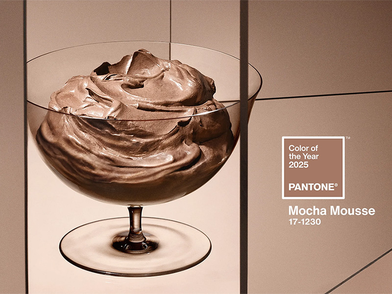
Mocha Mousse is Pantone’s 2025 Colour of the Year. Photo from Pantone.
Coloro and WGSN selected Transformative Teal as their 2026 Colour of the Year. There have been a lot of pale, pastel, minimal, muted palettes in recent years; this selection epitomises the trend toward alluring gem tones. (Like the browns mentioned above, gem tones might have been feeling a bit neglected!)
This teal is confident, but not overbearing – it has stories to tell, but it won’t force them on you. Gem tones will come alive when infused with natural light, which spaces will surely continue to emphasise in 2025.
Confidence, storytelling, colours that bloom in natural light – these approaches are excellent ‘trends’ to follow this year.
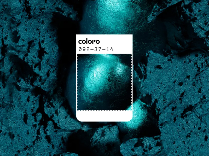
Transformative Teal is WGSN and Coloro’s Colour of the Year for 2026. Photo from WGSN.
Minimalism is warming up as designers eschew cool whites for warm, natural shades – especially in calming relaxation spaces.
Vogue expects all-white minimalist spaces to decrease. Warm tones and natural materials will step into that void. (Fortunately, if you have an all-or-mostly white minimalist space – I do! – it’s relatively easy to spice it up with accent colours. I’m still in the rusty-copper-orange, terra-cotta-with-lots-of-big-leafy-plants palette – and I’m not changing it anytime soon!)
The BBC’s 2025 trend colours are almost entirely the rich tones we mentioned above – but the settings are quite pared-back, allowing an often monochrome warmth to be set off by plants and smaller accents.
Worldwide, workspaces need to make themselves worth the commute – and as part of that movement, we’ll likely see more rest and recovery areas. These soft, gentle spaces where people can rest and recover will be perfect candidates for warm minimalism – and the colours will work well for years to come.
Warm, minimal neutrals will be a major 2025 trend in residential interiors. Photo from Apartments.com.
The colours mentioned above – rich gem tones and natural earthy browns – are clearly rooted in a longing for immersive, natural spaces. As a natural evolution of that idea, we expect biophilia to increase, becoming more expressive.
Big, leafy plants will be even more popular. Their planters will offer designers opportunities to create splashes of expressive accent colours on relatively large accessory pieces. (Planters can also serve as excellent acoustic absorption pieces.)
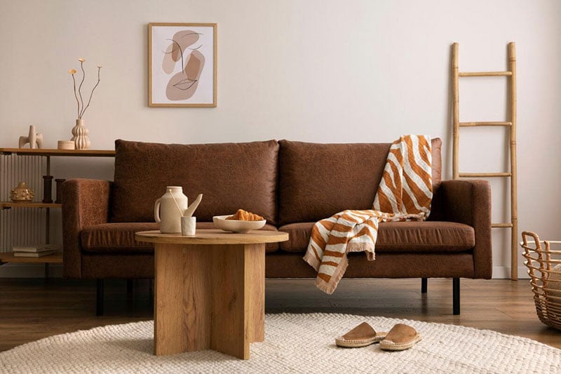
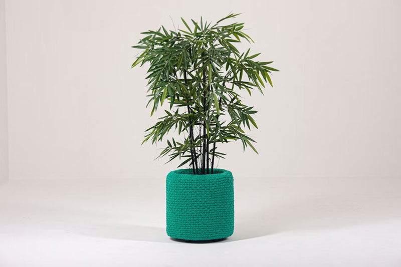
Planters represent an opportunity to add textured fabric, a splash of colour, and acoustic absorption. Photo from BuzziSpace
‘A colour is just a colour – until you do something with it,’ says Liz Teh, Haworth International’s Director of Space Design. She looks for what is ‘emotionally evocative’ in these sorts of trend colours, which are now being ‘applied to everything’ – including, with Mocha Mousse, the ‘culinary’ aspect of our lives!
Every colour is a possibility. Every colour will help a space evoke emotion. These trend colours – whether they end up on walls, furniture, or accent pieces – will be part of the stories space tell in 2025 and beyond.
And – just to reiterate one more time – when we talk about trends, our approach is to consider them fresh takes on the timeless. We don’t need to toss everything and buy all-new stuff – but we might be inspired to try a new combination or add a surprising accent.
Just remember to take these trend articles you’re reading (including this one!) with a grain of salt – or, maybe, with a scoop of mousse.
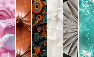
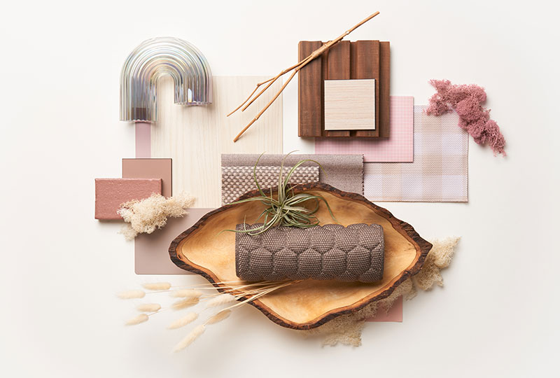
A moodboard for Fern Knit
16/12/2024 • 2 min read
Highlights from our insightful interviews with creative minds
03/12/2024 • 5 min read
Sensory-driven design trends shaping the future
28/11/2024 • 3 min read
Thoughts on collage, storytelling, and surprise